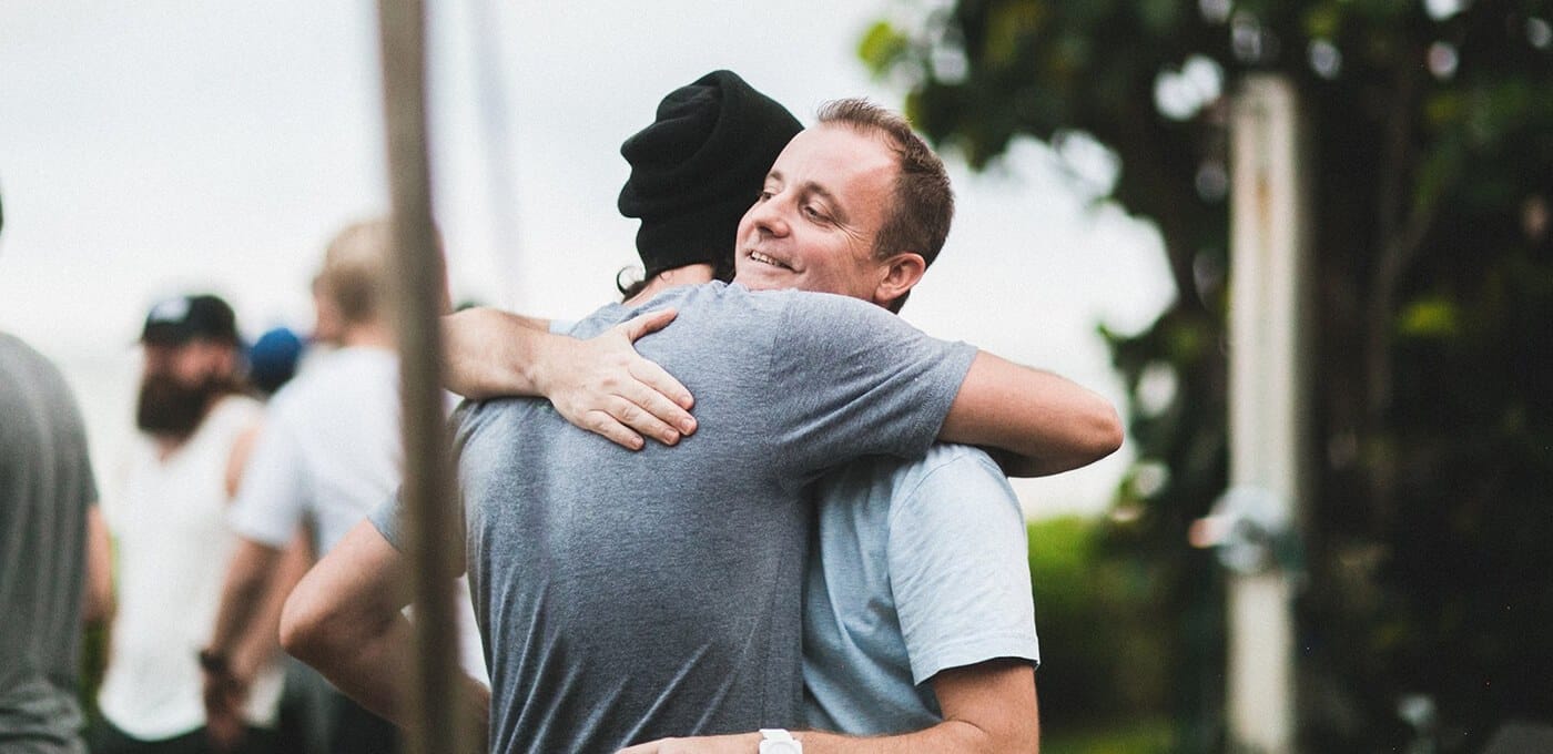
Ian is helping coach the internet our of its awkward teenage years
Interactive design is reaching a crossroads, and no one knows this better than designer Ian Burns. Ian is the group creative director of Huge , one of the largest and most respected digital agencies. With over a decade of experience in the field working for high profile clients such as Sony, TED, and Lucas Arts he has seen the industry transition from the overly energetic sites of the early 2000s to the reign of simplicity and minimalism, to today, a homogenized state Burns describes as the “ugly, awkward, teenage phase where everything is responsive.”
Burns is taking an active role in helping web design progress from adolescence to adulthood, by looking to bring back some of the beauty into today’s digital experiences. At Huge he manages complex projects with a highly talented team that works intimately with its clients from the get-go. We sat down with Burns to learn more about that process, as well as how he plans to bring interactive design and the experience of the internet, to the next level.
Take us back to the early days. How did you end up in the world of design?
Right after high school I got a job in tech support helping old people log in to porn sites and then every once in awhile the client hosting these sites would ask for design help, and it seemed like a lot more fun than doing tech support. I taught myself HTML, a little JavaScript, I had a bootleg version of Photoshop, and I just started mucking around… I got a job making websites for movies when I was 21—just four months after I first opened up Photoshop.
I worked for a company called Media Revolution (now Trigger), which created websites for movies like Spiderman and Men In Black. I wasn’t a designer, and I’m still not an artist. I didn’t have anything particularly interesting to say. I just kind of fell into it as it was a fun challenge.
How did starting out with coding as opposed to design affected your career?
I enjoyed the precision of old-school HTML. I liked that it is a contained idea, as opposed to design, which is so open ended. And without references of great design, it’s tough. I didn’t grow up with Eames furniture in my house; I grew up with Lazy Boys and popcorn ceilings. I think the coding helped me get my foot in the door, but then the design became far more interesting.
I LIKED THAT IT IS A CONTAINED IDEA
How has the web design world shifted over the past decades?
I started out as a stupid 22-year-old kid who thought that with Photoshop or Flash I could create the sort of experience that mimics the movie-going experience. A lot of pseudo-3D experiences came out of that, but at some point I came to realize that it was unfulfilling to make things that were just about me and were soon irrelevant. So a lot of us began to get interested in places like Huge, places that were most concerned with creating experiences that people use. I’ve always thought about design as, “How is this going to make people feel?” and applying that to things people actually find useful.
The interesting thing now is the pure aesthetic the transition that has occurred. Years ago companies like Huge were about this Swiss rule of grids and typography and making things simple and beautiful. Now, the internet is in this ugly, awkward teenage phase where everything is responsive and you have to make everything the same. Now I’m just trying to find that next phase.
For me it’s about bringing back the beauty and simplicity of the small touches that create visual interest, but do it in a way that’s extremely functional. Right now we’re creating functional work across multiple platforms that are accessible to everyone, but we’ve lost a little bit of the beauty of it. We’re in that moment where people’s perception and relationship with a brand is primarily digital and the physical relationship is essentially complementary.
I think the internet is uglier now than it was four years ago because of all the experiences and emotion we have to take out to make it accessible.
Web design is ultimately a service industry and you have to give clients what they’re asking for. How do you navigate that while also educating the client?
My approach has always been—both internally with my teams and externally with clients —that I tell them when I think they’re wrong or that what they’re looking for isn’t in line with what their users are looking for. I see it as my job to try to bring the two sides together. Now you call that “user-centric,” but really I just think it’s about bridging the gap between the two sides; it’s an interesting challenge that never gets old for me.
I SEE IT AS MY JOB TO TRY TO BRING THE TWO SIDES TOGETHER.
How involved are your clients in the design process?
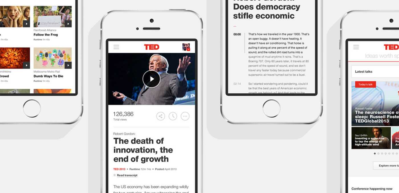
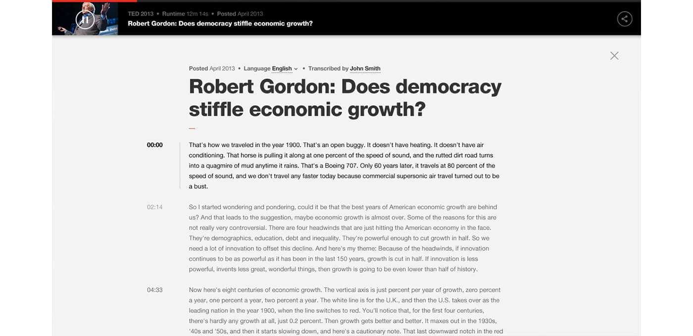
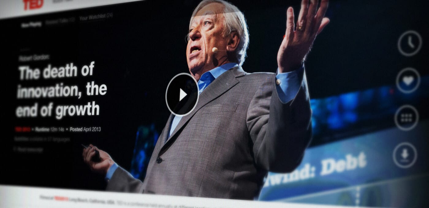
Clients today are so much more sophisticated than even five years ago. The people we deal with now are the same ones who have been building the internet. A lot of people running internal departments for marketing worked at agencies before. Most of the time I try to bring them into the process. The TED project was the first time that it became clear from moment one that we weren’t going to provide some insight that was going to surprise these guys. They knew their product, they knew their users, and they’d been working at this so hard for years that we weren’t going to come in there and find the needle in the haystack for them.
That was a realization that created a whole working process at the agency with this idea of not presenting and instead showing the work, bringing them into the fold like they’re part of the team.
If we can just let go of this idea that we need to sell each other on things and just be honest with each other, it becomes a great process.
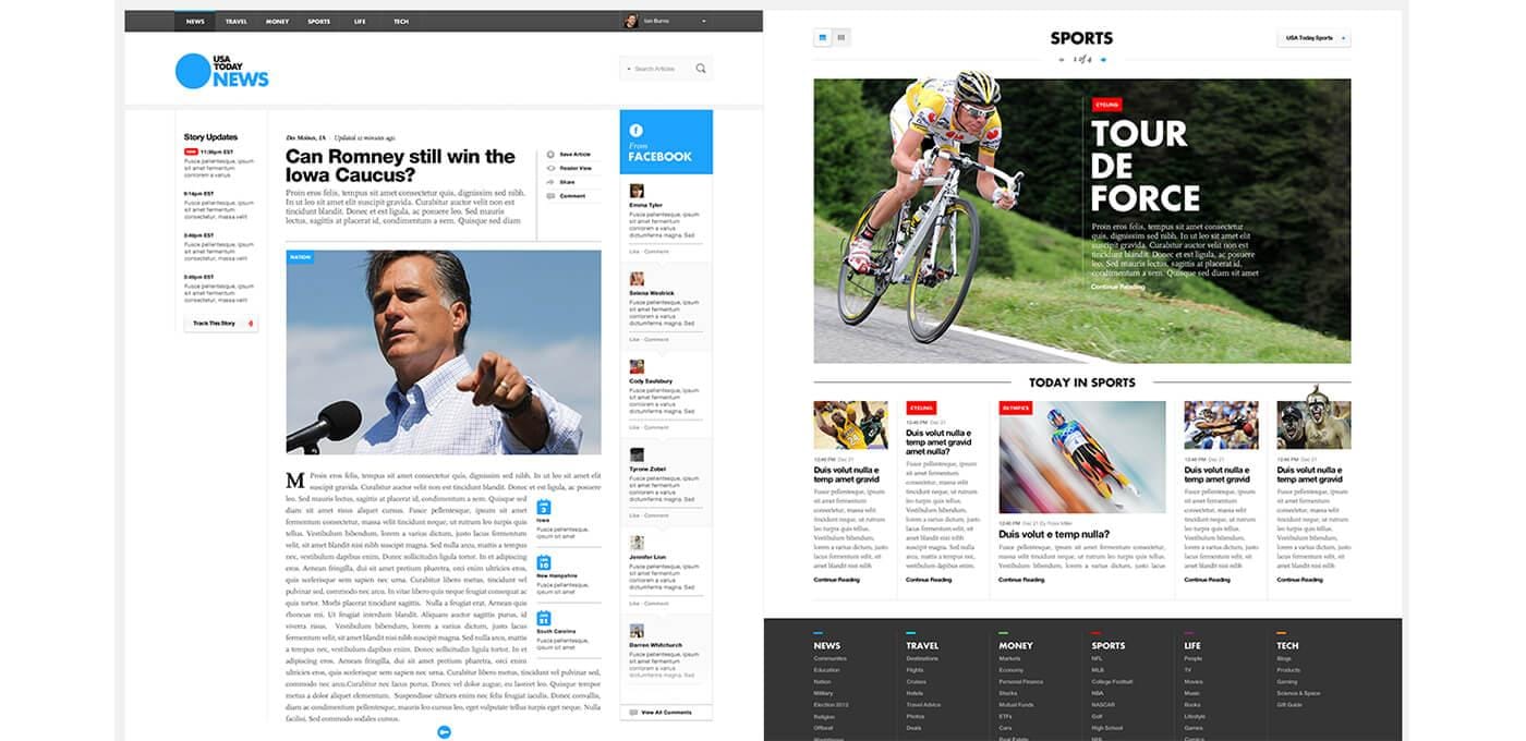
Is it fair to say having clients at your office is about real collaboration so everyone has equal footing?
Yes, and it’s totally changed the process. Embedded teams can work depending on what the type of project is but they can also be dangerous because you get this “Stockholm syndrome.” I am dealing with this right now as I have to constantly tell people that even though they are supposed to listen to what the client is saying they still need to be their advocate. It’s definitely changed the way we work. It’s basically including people as if they work with you, which has always been my approach to design. I think that is the big difference between traditional agencies and digital companies.
What do you look for when hiring for your team?
I have a philosophy about what it means to be a good designer. For me, the perfect designer is 25% visual, 25% experience, 25% strategy, and 25% visualization. I cast projects that way as well and balance teams out by pairing people who are complementary. And then you need to fill the gap… I personally try to fill the gap wherever it is.
How do you handle failure in your process?
Over the course of my career I transitioned from a person having the time of his life, fooling around, and getting paid to realizing, “Oh, now people depend on me and I need to get my life together.” During my first year at Huge I was having panic attacks all the time, afraid I would get fired and everything would blow up in my face. Once I realized that if I looked to the person next to me who cares as much as I do about this and share some of the burden with him or her and realize we’re in it together, fear went from being a thing that freezes me to fear being a thing that motivates me, to fear being addictive. Right now I’m addicted to the fear of failing. Not failing because I don’t know what I’m doing, but because I didn’t try hard enough and didn’t look under every stone.
Finding technical talent is not the issue for me anymore. It’s more about who you want to communicate with. I want to make the most of every moment I have to make sure I am spending all my time on making things better and less on bullshit and presentations and more time on actually doing things and talking less. I can work with people across multiple time zones and the fact that we can do this because we are working with smart, talented people means we should just keep on pushing it and seeing how far we can go.
