A Q&A w Bryan Le, the Director of Product Design at Compass

Product designer Bryan Le works for a real estate agency, which ranks slightly ahead of insurance and health care on the list of the least creative career fields in the world. It’s an industry he chose willingly by leaving his post as creative director of the ultra-cool agency Rokkan to become the first director of product design at Compass.
So what prompted the move? It certainly doesn’t hurt that the next gen real estate brand was just valued at $1 billion. But what drove Le to make the change was the ability to design tools that are both pretty and user friendly -- a seemingly mutually exclusive ideal in the field that prizes customer transactions over bold, provocative designs that win awards.
By bringing an agency background to a product role, Le’s aim is to ease the tension between these two forces and blend the blue sky thinking of agencies with the product development ability of product organizations. Le is working tirelessly to change the way real estate functions by bringing digital value to a domain that was virtually void of it.
Le has been blending commerce and creativity since he was 16 years old when he built a business making websites for professional gamers. He started college at the University of Maryland, but never graduated because he skipped too many classes to continue operating his e-sport business. His ascent as an interactive designer is helped by his drive, bravado, and a clear sense of purpose. “I live, breath and need design,” says Le. “It’s my whole life.”
We sat down with Le to gain a better understanding of how different life is designing within an agency to working in-house on product, how designers can bring values to industries devoid of creativity, and how he makes sales tools look good.
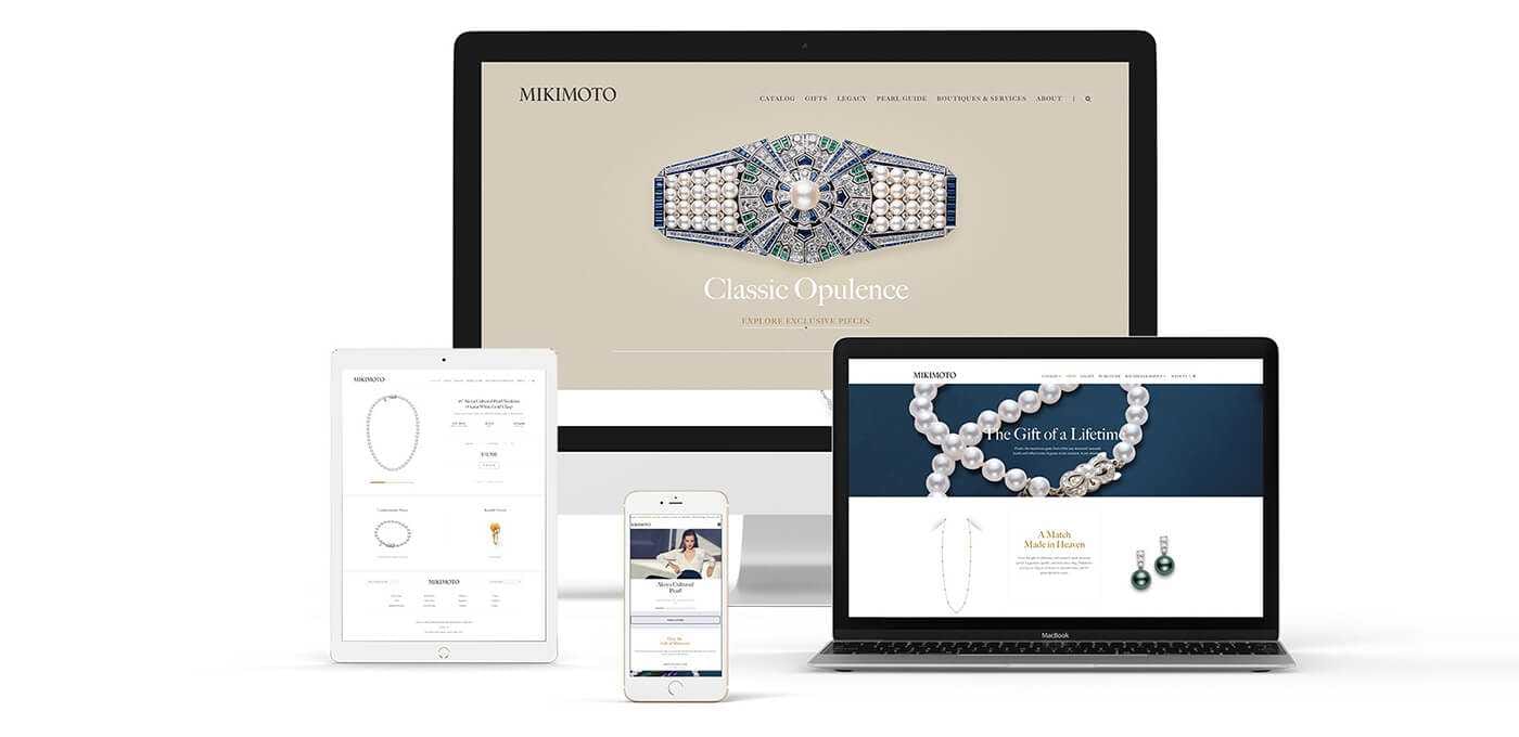
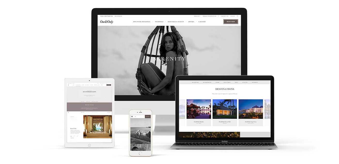
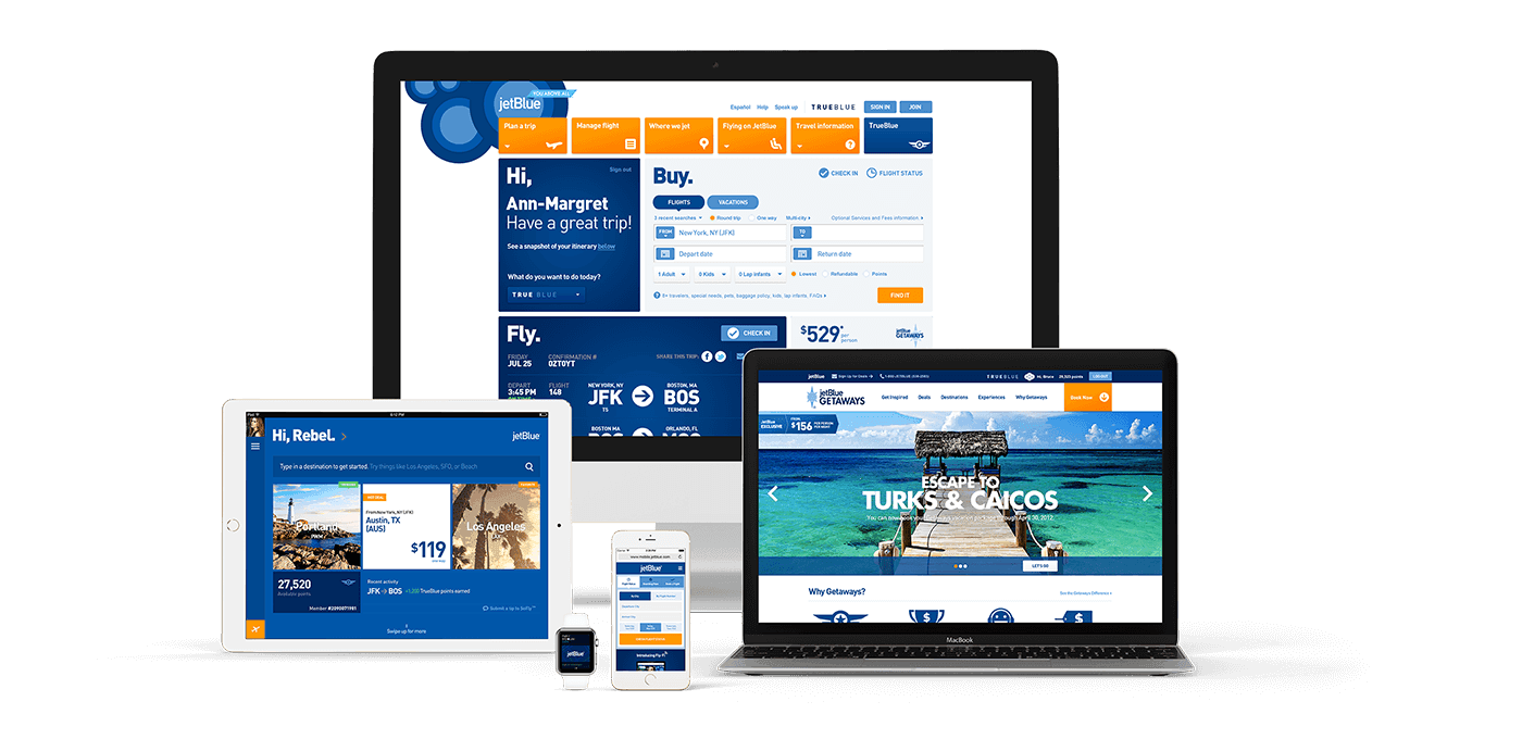
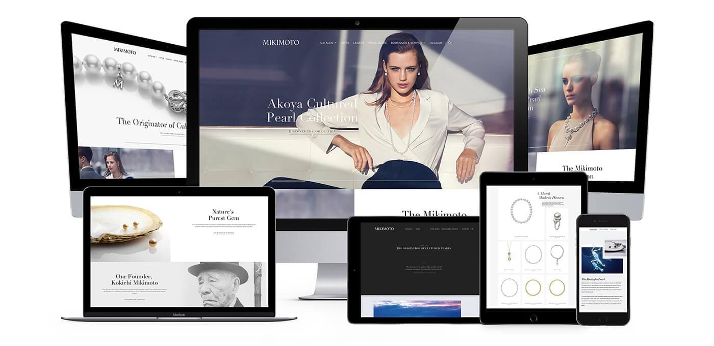
You come from this visually rich, multi-layer world, making websites that win awards for agencies like HUGE and Rokkan. Was there a mindset shift you had to make when you started in-house at Compass?
I believe that every solution has to be beautiful and beauty can be found in many different ways. It can be found in the visual execution or in how easy something is to use. If something is impossibly beautiful, there’s beauty to that. I can still approach these problems in a visually stunning way - it still has to look nice. I look at AirBnB and material design and there’s executional polish there that other tools simply don’t have.
As the first Director of Product Design at Compass, what have you been tasked to do?
Compass is a technology-first real estate brokerage, with the big differentiator being our technological capability. What that means is that we are creating products that are solely focused on user experience, and that is my number one task: creating the perfect user experience through design and an understanding of the real estate agents’ work flow. The average agent spends 90% of their time doing tasks that they shouldn’t be doing because of archaic systems that take forever, but my job is to create products that mean they spend less time doing those things and more time making money. We are building tools that automate things that other companies do manually.
How has your experience in digital marketing and immersive experiences translated into working on an internal product?
The biggest fundamental difference to me between an agency and a product is essentially the engineering part of it and being able to create ideas that are either founded in reality or blue sky. Agencies are great at blue sky, while product teams are really good about moving the business, so the tension between the two is why product organizations work with agencies and vice versa. For me the skills that I have brought with me from an agency having worked on all those Flash websites and coming up with crazy Photoshop things is that it has enabled me to approach my design solutions with a very different aesthetic to what you’ll see in the product world. There’s a level of depth I’m able to push for in solutions because it’s not just about the flat surface; it’s about understanding how depth can play a role in visual hierarchy. The thing with products, and especially where design is headed now, where it’s very flat and all about being minimal, is that it can be hard to distinguish hierarchy, so it relies a lot on sizing.
How is the decision-making process different inside a company compared to an agency?
The tools we are making are for the agents, we have the ability to simply schedule a user testing session with 10-15 agents to validate an answer and make sure it’s working. Anyone who works at an agency will tell you that the first thing to get cut from a scope is user testing! So you end up getting into a subjective debate with a client over what looks good and it’s never about how well something actually works. There are some design agencies that make things to look pretty but that don’t necessarily work. So the design process at an agency comes down to really unvalidated tests that carry a ton of consequences. At Compass, because we are all working on the same problem, we can all agree on everything at the very beginning and then have that validated through actual tests. That way, it’s extremely objective and pragmatic and becomes about solving a problem and not about one person’s opinion. Having everybody after the same objective means everybody can agree on why it’s important for the business, and not why it’s important for one person’s ego.
ANYONE WHO WORKS AT AN AGENCY WILL TELL YOU THAT THE FIRST THING TO GET CUT FROM A SCOPE IS USER TESTING!
What are your main design goals there?
My goal is to flip that 90/10 ratio for a real estate agent where now they are spending 90% of the time doing things that are productive instead of the current 10%. If I can do that I get a 900% increase in terms of how much money they can make. I say it all the time here, paying off that 90/10! The more we can shift that scale, the more money our agents are making and the more money our company is making. I need to make sure the tools we make are making the lives of our agents easier so they can make more money.
Is there a plateau to the efficiency you can create?
I’m going to plead ignorance and say no, because if there is a plateau I don’t want to know about it. I want to perceive this horizon that I’ll never be able to reach and just keep going for it. Is there a finish line? Success will be when we flip that 90/10 ratio.
IF THERE IS A PLATEAU I DON’T WANT TO KNOW ABOUT IT
How then does Compass determine how much value you are creating through user experience?
Every week we have a matrix review during product strategy. It’s a weekly recap of every tool we have as well as how people are using our site now. It’s essentially analytics, but we can see how often agents are creating a tour or scheduling meetings, so we can constantly track movements within those metrics. It helps form our business objectives when we create new products. It could be something as simple as calibrating a small tool we have or something as crazy as creating a brand new product from the ground up. If a product owner sees their numbers are falling off, they are going to open an investigation to see why that’s happening and pinpoint how to solve that problem and that’s where we come in. At an agency try getting an answer back from a client in an agency like that — instead you operate on assumptions.
Real estate as an industry might seem fairly boring to a designer on the surface in the way designing for an insurance agency might be. What attracted you the real estate market?
The kind of people I hire are the people who are driven by solving problems. It’s the number one thing I look for in a designer. I want someone who wants to crack the code. That’s fundamentally what we are doing - the design problems we have here are really challenging, but above that our brand is actually really sexy. Real estate has a very emotional connection and the brands out there have been so stagnant that it’s been giving real estate a bad name. It’s actually very challenging and very beautiful because you are able to connect to someone. Buying a home is a big life decision and a long process, If you don’t design properly it’s going to be a headache. All these tools that no one sees are really important as it’s helping people buy a home. If that doesn’t turn you on, I don’t know what kind of designer you are.
ALL THESE TOOLS THAT NO ONE SEES ARE REALLY IMPORTANT AS IT’S HELPING PEOPLE BUY A HOME. IF THAT DOESN’T TURN YOU ON, I DON’T KNOW WHAT KIND OF DESIGNER YOU ARE.
