Explaining the rise of the UX role and how it integrates with interactive teams.
In a world where “flat” web design is ever-present, it can be tough sometimes to tell the difference between a wireframe from a final deliverable. Which is one reason I hear this question over and again: “Exactly what is the difference between UX and UI?”
The devil is in the details, so let’s make sure we’ve got the basics covered first. UX stands for user experience and UI stands for user interface. According to user experience consultant Jakob Nielsen, a user experience designer is someone who “encompasses all aspects of the end-user’s interaction with the company, its services, and its products.” While Nielsen may be the leading UX guru, that definition doesn’t exactly clear things up for most people.
One reason there’s so much confusion around UX and UI designers is because they’re joined at the hip. The line between where one discipline ends and the other starts is blurry, to be sure, and to add to the confusion, different teams take varying approaches as to how the teams should interact. Over the past few years, UX designers have risen in their roles in the interactive team. Anton Repponen of interactive design duo Anton & Irene, stated “Before UX designers were a solidified role, UX was still happening. It might not have been good UX, but it was still happening.”
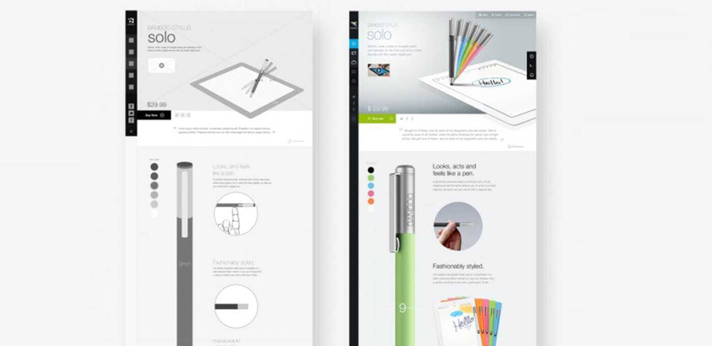
Literal Wireframes courtesy of Fantasy
For years web and app designers ruled the roost. What, you may ask, has changed so significantly that you now require a whole new person on your team? The simple answer is that interactive design has evolved from a few page brochure-style site to complex digital products and experiences; as it has grown, so has the role of UX designers.
Let’s break down what, exactly, a UX designer does. The UX designer’s main deliverable is a wireframe. In case you’re not familiar with wireframes (and bear with me if you are), they’re blueprints for an interactive experience. Wireframes essentially lay out all the content for a website or app and establish a visual hierarchy.
Wireframes serve two key roles: to clarify how a site or app will work and to think through the more complex problems. Wireframes are intentionally bland, with grey boxes and a simplified framework in order to provide focus to the content, and in many cases to allow sign off from the client. They are vital in confirming all the content planned to go on the site so you don’t find yourself adding “that missing paragraph” in round three of design.

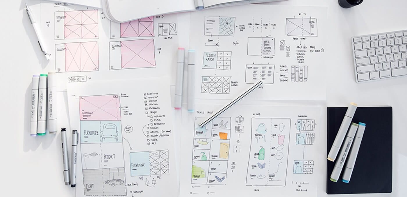
Pencil Sketches courtesy of Claudio Guglieri
With tools like Axure, Framer, and Invision, UX designers are also adding value for teams and their clients by taking on prototype creation. By creating clickable interactions, a wireframe feels more like an end product and user testing can begin immediately. A great UX designer is looking for innovative and surprising solutions to problems. Prototyping is becoming a bigger part of the UX role, which helps everyone understand the project before there are pictures, nice fonts, and colors in the layout.
The second role of wireframes is to set a framework so UI designers can do what they do best: provide visual emotion and context to the content. Typically, UI designers pick up the design from the intentionally bland black text and grey boxes and explore fonts, colors, sizing, and placement. This is where the content is brought to life by pairing images and copy, refining type hierarchies, and setting things on a grid. UI designers are concerned with the overall aesthetic of the brand and the way it will make users feel.
“HANG ON! DIDN’T YOU JUST SAY THE UX DESIGNER PLANNED THE HIERARCHY? WHY IS THE UI DESIGNER RE-DOING ALL THIS WORK?”
This is where the partnership between UX and UI really comes into play. Some teams consider the UX job done once the wireframes are approved, while others have the UX involved all the way through to launch. Some teams make pixel-perfect wireframes, some make sketches, and others leave things loose and open to interpretation for the designers. Like many areas of design, there’s no right answer for this process besides open communication.
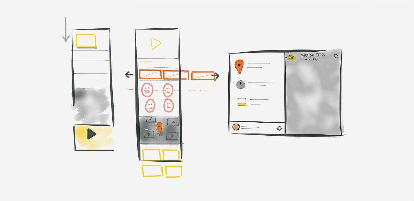
Loose wireframes from our Ernie Ball Project
With the rise of the UX designer’s role, we’re also seeing new tools arrive on the scene to accommodate this process. Apps like Sketch have created the ability to make one file that can start with UX and go all the way through to design. This has prompted Adobe’s much-anticipated Project Comet, the first product designed to embrace this new paradigm and allow users to wireframe, prototype, and design in one app.
When I think about the difference between UX and UI, I think of left brain vs. right brain. And although the lines can sometimes cross, UX and UI designers really do carry out different jobs. Whether you’re making rough sketches to quickly communicate an idea, or are creating pixel-perfect wireframes, the UX designer is trying to solve functional problems, plan content, and organize site data. The UI designer is responsible for conveying the brand and making the site a more pleasant and human experience.
Yes, we might see some overlap from time to time, but the inclusion of both makes for far better projects and superior outcomes. (And if you’re looking to up your UX game there are loads of resources, like this wireframe inspiration post on Medium.)
*UI sketches courtesy of Anton & Irene

