A blockbuster reboot for the ultimate moviegoing experience.

Metajive partnered with Harkins to elevate their digital universe and reflect their unmatched quality and brand loyalty, while prioritizing business goals. With over 900 unique screens across the website, app, e-commerce store, ticketing platform, and account center, we took five projects and merged them into one to create a seamless experience for all Harkins users.


Challenge
When we started this project, our biggest concern was launching before the newest 007 film would hit theatres. Within a few weeks, we were in a global pandemic that hit movie theatres especially hard. This amplified the suspense and drama for sure but also upended the reality of what Harkins needed to be successful. Which was a lot. We identified over 300 features to explore, all of which needed to work together to create a cohesive journey for customers. We weren’t just building a website, but five distinct digital experiences that integrate smoothly between the home and the theatre. All while selling enough popcorn to feed a T-rex.

Digital Brand Expansion
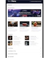
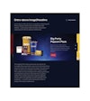
Harkins’ theatres are bold, stylish, and fun. Their digital ecosystem needed to convey these key attributes in a way that felt true to Harkin’s legacy. We identified visual tokens that represented the best parts of going to a Harkins Theatre, like dark cinematic tones and ambient light that we translated across the visual language of the project. We redefined color palette, typography, promotional materials, wayfinding, iconography, interaction design, and how we feature films. The result is a striking signature style that celebrates the elegance and joy of movies and Harkins theatres.
Strategy
Our strategy was, first and foremost, to be the customer’s advocate. We knew we needed to make it about more than just movies, and to create an emotional experience that would further differentiate Harkins from other theaters. We set out to make it as simple as possible for users to complete anything they needed to do – whether that meant browsing movies, purchasing tickets, buying popcorn, and more.

Design
Our task was to build a design system that lived up to what a modern movie theatre website should look and feel like. This meant we needed to get into the details of every aspect of the design. From UX and UI design through interaction design and creative development, our team built a cohesive design system that not only worked to sell tickets and popcorn, but really differentiate Harkins from the competition.


Details we love
Color Palette

Typography

Movie-specific Spotlights
Technology
With ambitious goals of creating a next-level customer experience, the technology behind this project needed to be seamless. We brought multiple complex pieces of infrastructure into one experience so it could be managed in one place by marketing. We created a headless CMS and then built custom API layers from there. We integrated the store, the awards platform, the app and customer profiles. We built the front end with React and iOS and Android apps with React Native.

Project Results
We were fortunate enough to work hand-in-hand with the Harkins Information Technology team on a project where we could employ best-in-class standards from ticketed experiences globally. With an end goal of creating a customer experience that goes beyond the practical and invokes the emotional through cohesive, intuitive, and seamless touchpoints, we were able to change the theater experience. The Harkins customer can enjoy a multi-device experience that brings joy before even stepping foot in the cinema.
One more thing.
RELATED PROJECTS
Website

User Experience Design


