We teamed up with Nike Running to spread the word about their Audio Guided Runs, making it easier for runners of every level to lace up and enjoy the miles.
Ten million AGR plays by May 2020 shows people weren’t just trying it once—they kept coming back.
During lockdowns, AGR exploded—Nike Run Club gained a million new users in one month and total runs shot up 42%.
A 4.8-star rating (hundreds of thousands of reviews) proves AGRs work—they’re free, and they keep runners loyal to Nike.
Services
Strategy
User Experience (UX)
Website Design
Design systems & scalable components
Responsive Web Development
Content Creation
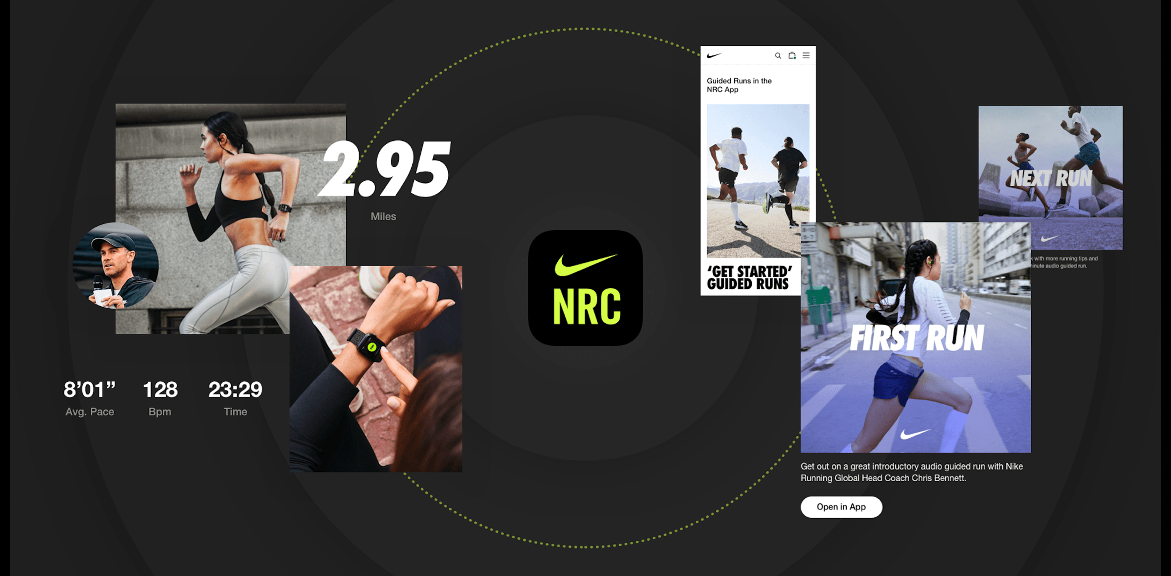

Nike’s all about getting more people into running and showing every athlete what’s possible. Their Audio Guided Runs deliver coaching right to your ears, so anyone can get better with every step. We helped Nike spotlight this feature across their global sites.

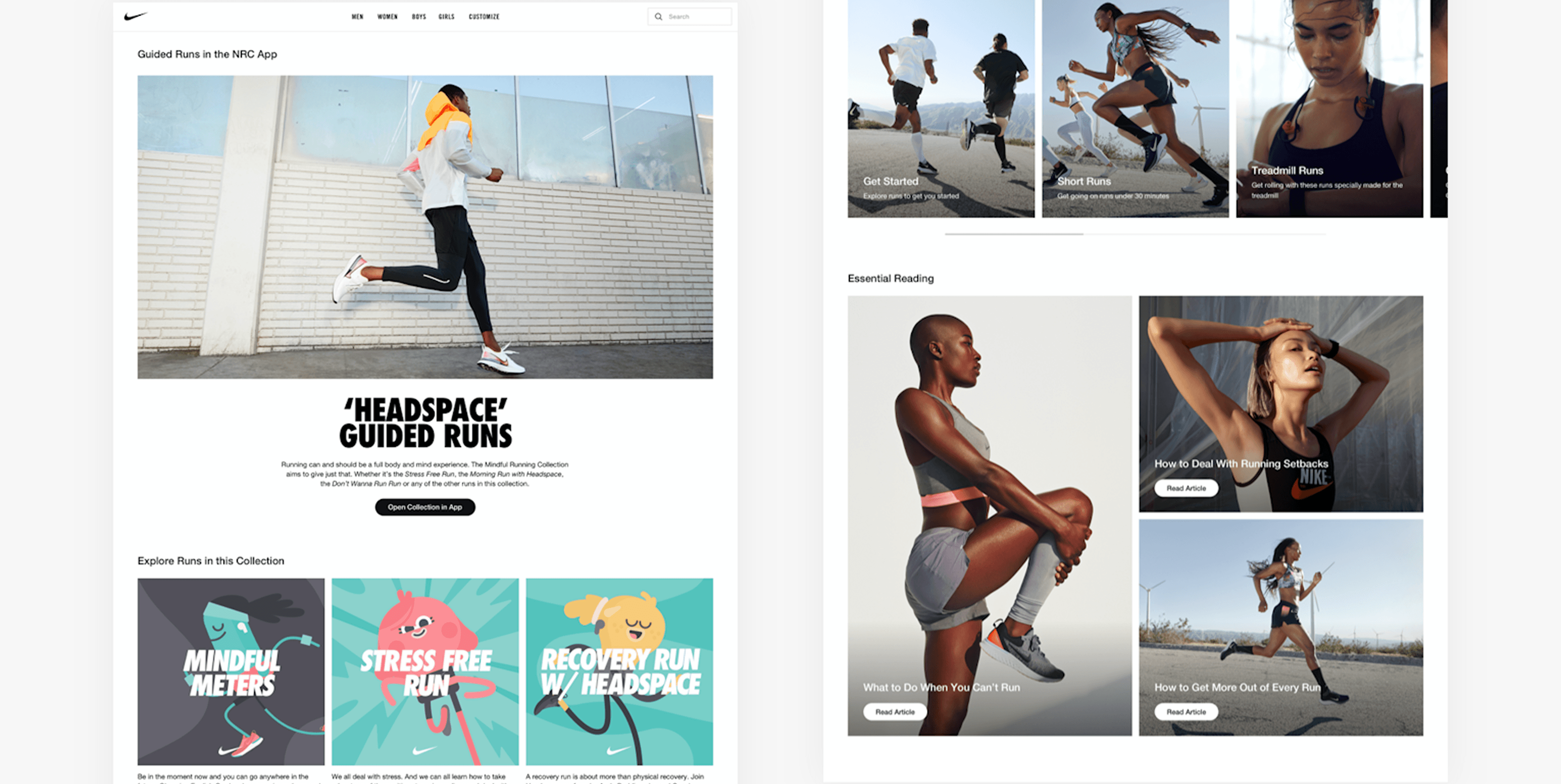
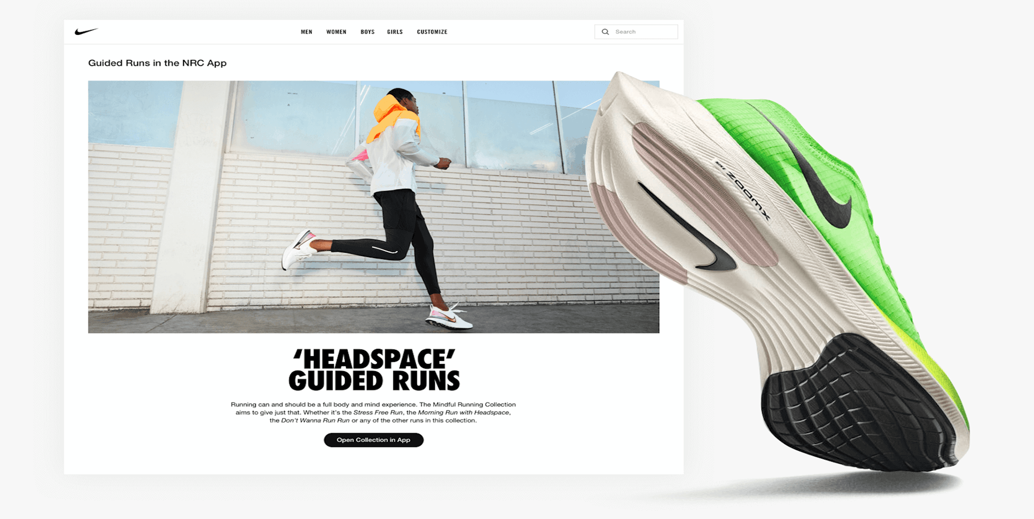
With buzz building on social, Nike needed a digital home base for Audio Guided Runs. We built out pages that organized, showcased, and captured what makes these runs stand out.
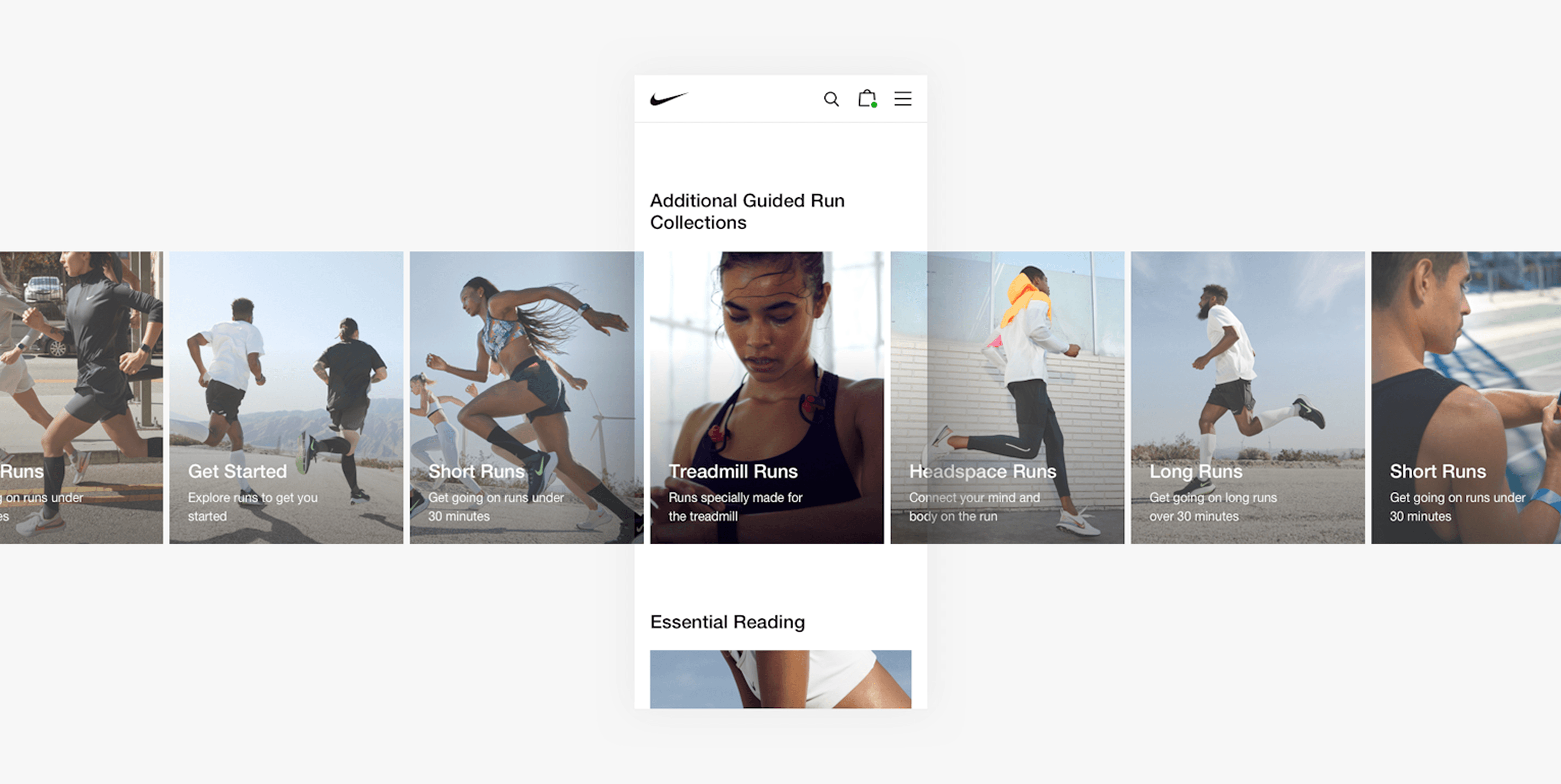
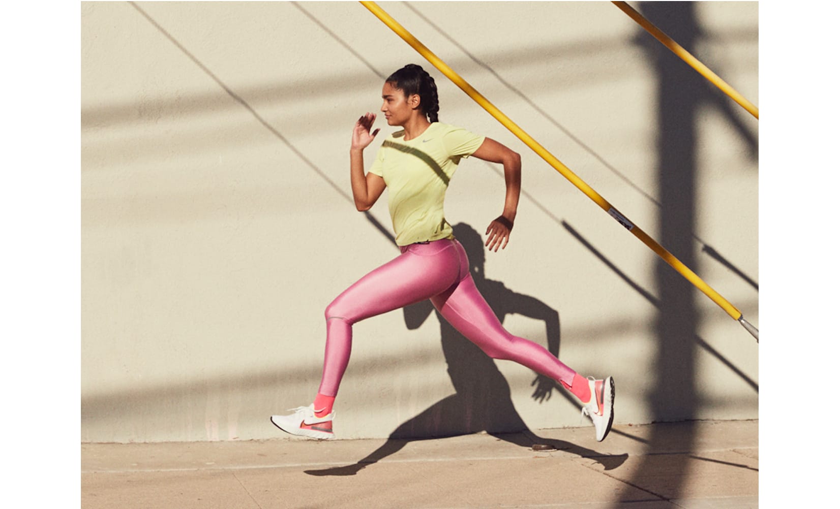
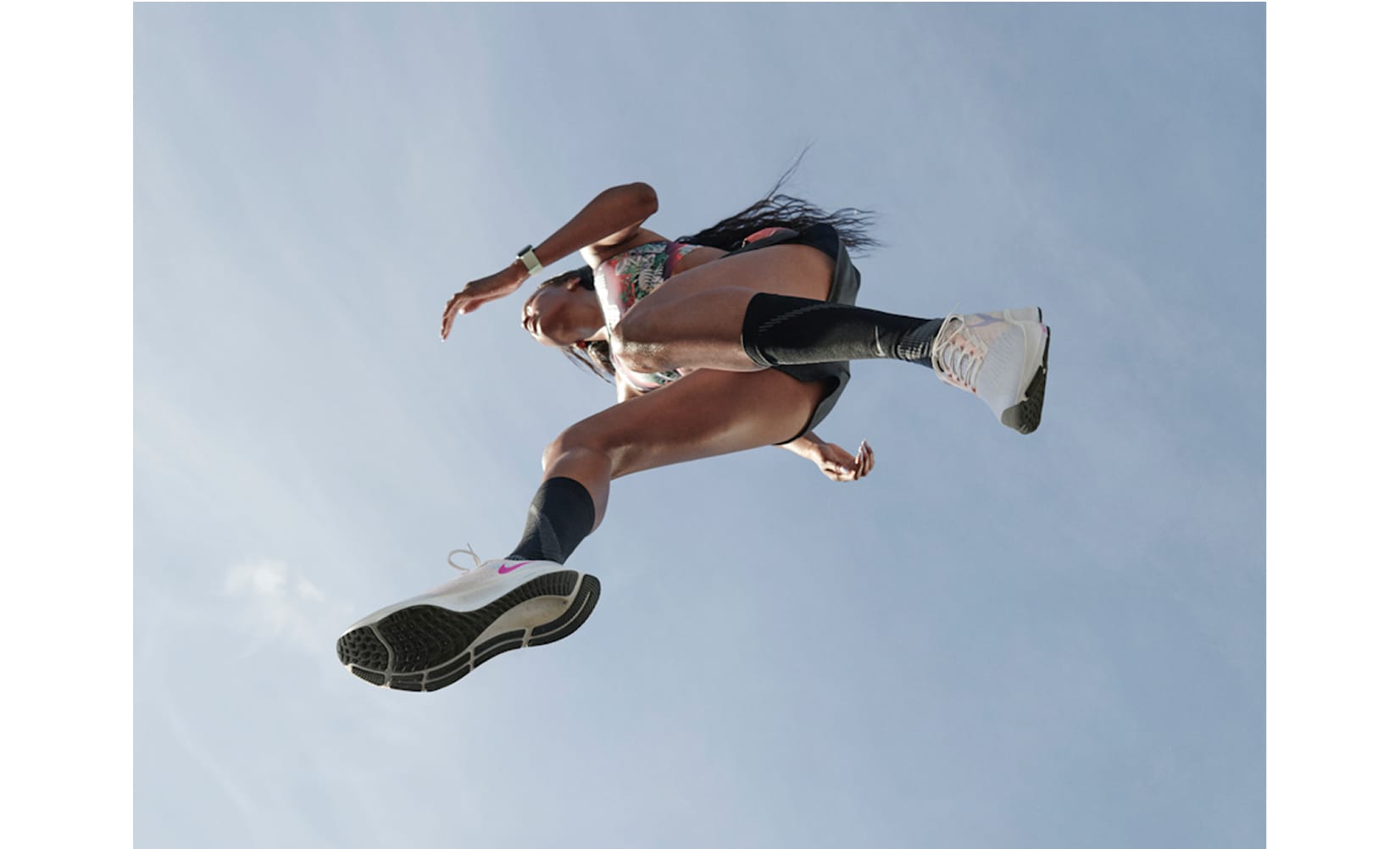
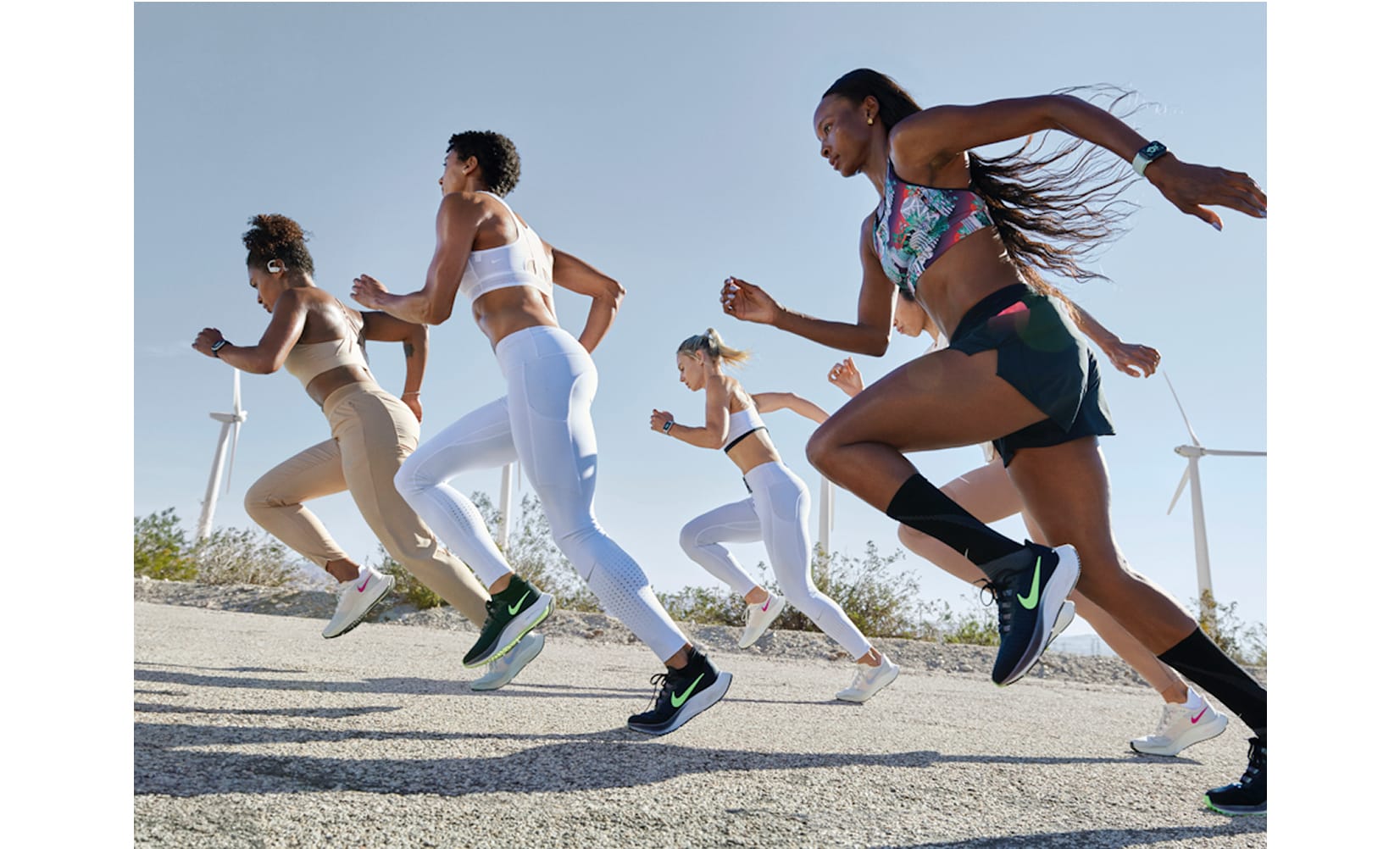
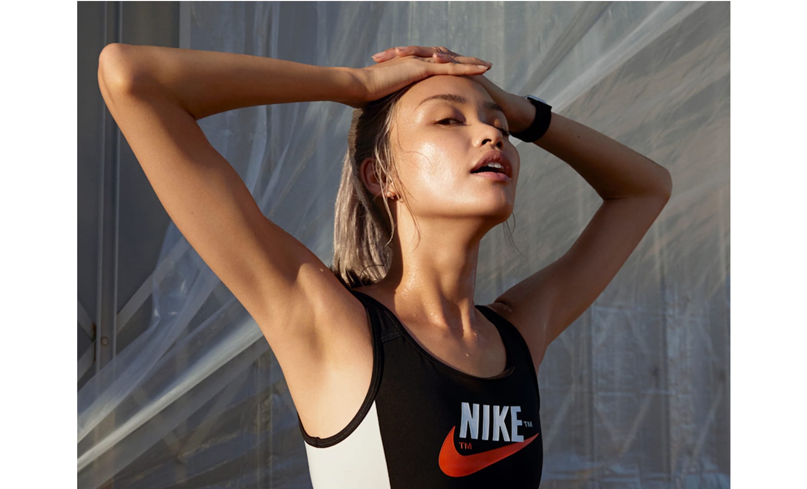
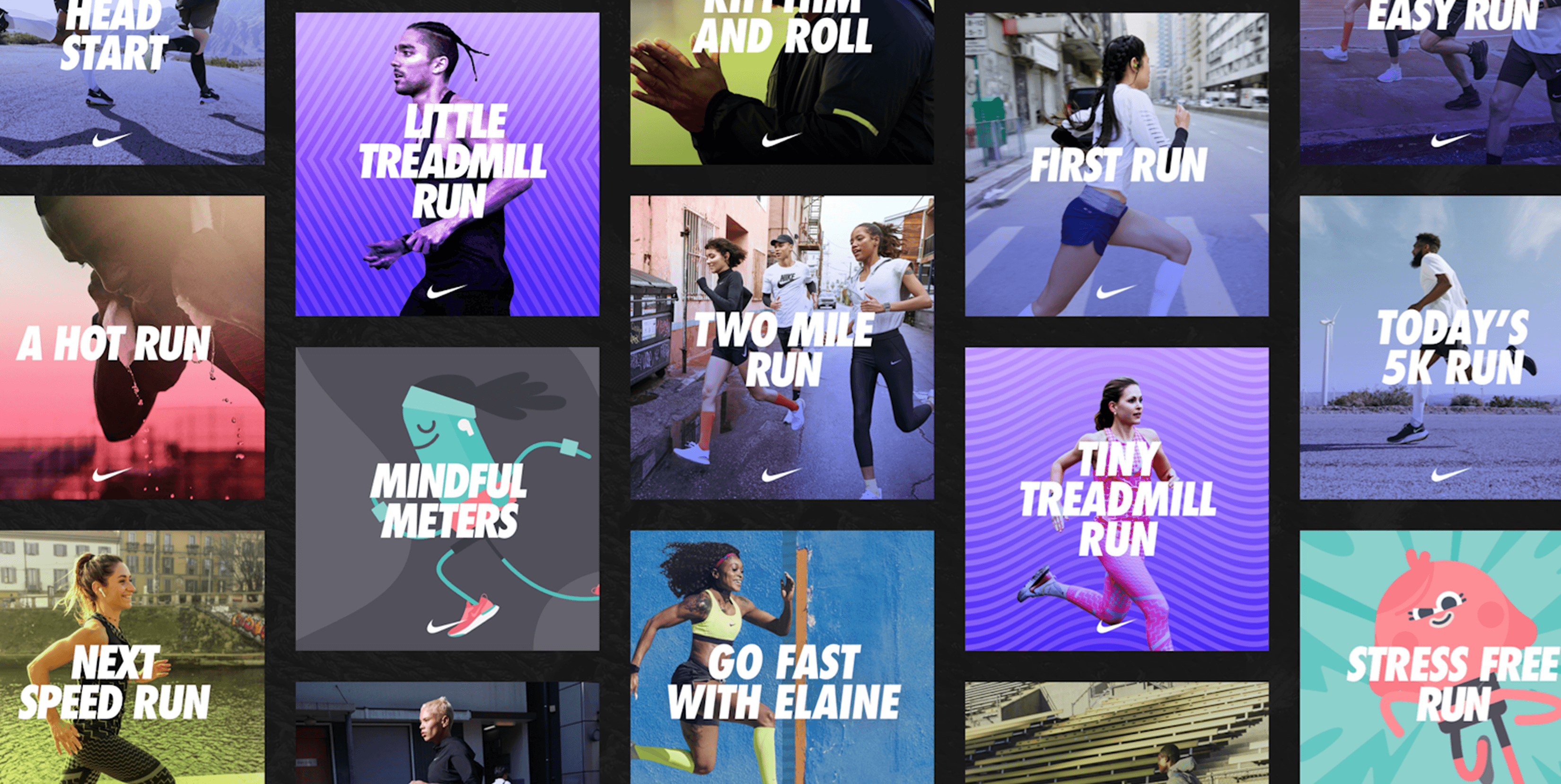
Using Nike.com’s global design language and app assets, we crafted a clean, intuitive system that puts easy discovery front and center. Authentic, relatable imagery makes every runner feel at home—not just the pros—so finding the right guided run feels natural and inspiring, no matter the goal. Bold text and pops of color add personality and make it easy to tell different types of runs apart at a glance. The experience works beautifully on every device, but it’s especially dialed for mobile, where most runners are searching for their next run on the go.

It’s always great teaming up with Nike—especially for a project we believe in. We built a seamless digital hub for Audio Guided Runs, making it easy for runners of all levels to discover, explore, and get inspired. The end result: more people finding the right run, and a digital experience that lives up to the Nike name.

